Website powered by

Get better at drawing and building your Visual Library

General / 23 April 2019

Years ago, when I started building my Visual Library for the first time, I just copied reference after reference after reference. That was a good start at that time, but recently I discovered that I had to switch to a more challenging approach sooner.

Once I got the hang of the fundamentals like perspective and my overall line quality was improving, it was time to take everything to the next level. I didn't and as a result, I wasn't improving as fast as I could at that period in time. This is the reason why I'm writing about this because I notice that most of my students suffer from the same ill-thinking. When I was building my visual library, I was just copying the reference images without really thinking about ways to recreate it later. The problem then is that the topic I was studying was not really sticking in my mind. If you start practicing with the right mindset and techniques, you'll build your visual library quicker and get better at drawing faster.


Make your own rules

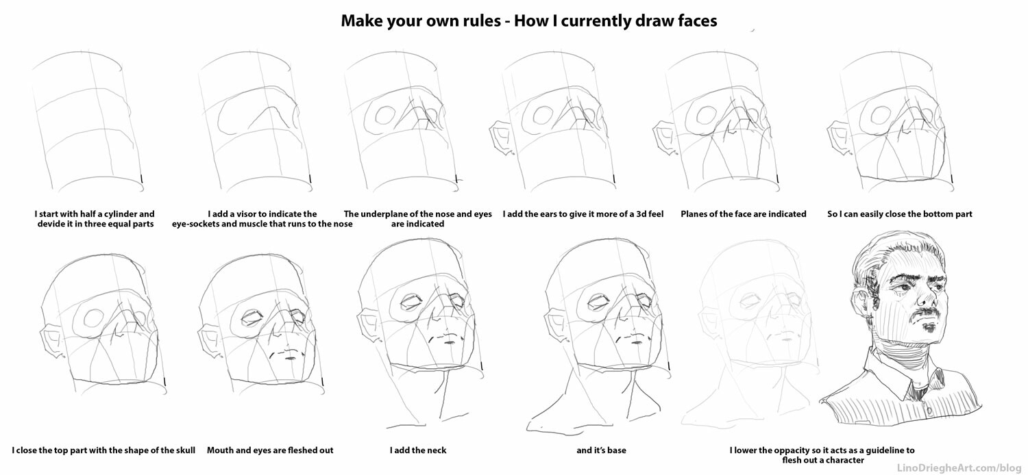
Nowadays, when I study to build my Visual Library, I brake down the reference in basic shapes and find my own workflow to recreate it step by step. I use small guidelines that I can use to remember how to draw something. The steps are not too complex so I remember them better when drawing. Working with basic shapes like boxes and cylinders allow me to recreate the reference more easily in perspective.

This is how I go over drawing a reference to build my visual library. I compare it to studying for a test. I would question myself over and over to see if the matter sticks:

  1. Draw without the reference (I check what I already know about the topic)
  2. Observe the reference. (I make a list of elements that make up the topic I'm drawing)
  3. Start drawing from the reference (I break the reference down in simple shapes and steps. 'What would be the most simple way to remember this part?')
  4. Draw without the reference (I test myself)
  5. Check the drawing with the reference and fix the problems (I adjust the simple shapes or steps when needed)
  6. Draw the reference from a different angle (I check of it really sticks. This step you can do every moment of the day!)

Finding the best simple shapes or steps to recreate the reference I'm drawing can be hard and for me. It depends a lot on the complexity of the topic. That's why I often times repeat the process from step 2 until I can draw the object from my imagination in every angle possible.

To give you an idea, I'm currently studying drawing the head from every angle possible. I'm currently using the steps below to get there. Obviously, the only way to get better is to study more from references and refine my workflow (step 5)


I'm definitely interested to find out how you practice your drawing skills and how I can improve my way of working. Please find me somewhere and let me know!


This article appeared first on my blog: https://www.linodriegheart.com/blog/       

Report

Weekly Art Blog #27 :Plein Air Painting trip to the Ardennes

General / 26 August 2018


Two weeks ago I took some time to go painting outside while I was in the Ardennes (a region south-east in Belgium). It was the perfect place to practice my analogue painting skills. If you don’t know, I recently started working with oils. In total I was able to make two paintings on 24cm x 30cm canvases. They’re quite cheap and low in quality but they’ll do for now. I’m looking into buying other formats for my next paintings as well, so should you have any tips on that, please let me know!


Sunflowers


The first painting was done in the sunny noon. I was captivated by the light on the sunflowers in contrast with the cooler shades surrounding it.

I started with an underpainting of a diluted Burnt Sienna to block in my composition together with the light and shadow patterns. I gave it some time to dry and I was quite happy how it turned out in the end. Starting with an underpainting gives me a good starting base to continue blocking in my colors in the later stage.
I recently purchased Landscape Painting – Mitchell Albala in which he goes over his painting process step by step. After creating his underpainting, he uses it to match the value of his chosen colors to the underpainting. Quite helpful! (I have Resourcespage here on my website with other helpful books and links should you be interested)


Cows that didn’t stop eating

It was overcast and raining lightly when I sneaked outside for my second painting while my baby-daughter was fast asleep. Don’t worry, there were still some adults back home to take care for her!
Because she sleeps around two to three hours at noon, I had a limited time frame to finish my paintings.

For me that time frame included first of all getting to the desired area by foot. Then I searched for that right spot, shot, composition, … whatever you like to call it. It’s that one ‘thing’ that triggers you to start painting in the first place. It could be a certain arrangement of shapes, light and shadow pattern, textures,…
The ‘thing’ came to me when I saw cows grazing on the open meadows. The green of the trees and brown of the fields gave nice color contrasts (you have to know, all the meadows in Belgium turned brown because of the extreme sunny weather).

I installed my gear and started with an underpainting using a diluted Ultramarine Blue. I messed up my underpainting though -I felt nervous because of the rain and being under a tight deadline. I had time until my daughter woke up-. Luckily I was able to fix the composition and I’m still quite happy how it turned out. After a good hour and a half I got a text my daughter was awake -time for some family quality-time!-, so I cleaned up and went back home.

I’m hoping to take this one into Photoshop and do an overpaint of it soon!


This article appeared first on my blog: https://www.linodriegheart.com/blog/       

Report

Weekly Art Blog #26: 4 Tips to Improve Your Painting Speed in Photoshop

General / 11 August 2018


Being a good digital artist is not only about being good at communicating ideas with pictures, but also being a fast and efficient worker when painting.

Often times I see my students struggle with this. Normal because most of them are just starting out with digital painting. But I find it important that you learn the right habits from the beginning. That’s why In this post I’ll give you some tips and tricks to improve your working speed.


1/ Use and map keyboard shortcuts logically

First all, when considering speeding up your workflow, you want to start using keyboards shortcuts.
I don’t think there is one single artist out there that doesn’t. At first, going back and forth to select a tool or option manually will seem like no big deal. It will look like you’re wasting no time at all, but you do. If you would map every time you repeat that same action, you’d be surprised how much time you’re loosing during the total time of your project. In the end, why bothering going over to right end of your screen to find the desired tool, then searching for it, and finally selecting it, if you can just get there with a shortcut?

Secondly, I like to map these shortcuts logically so they are all reachable with one hand (ie. my left hand). That way I’m not getting in uncomfortable positions to reach the right shortcuts. Next to that, it will speed up my workflow just that little bit more. It also lowers the chance of having Carpal Tunnel Syndrome.

Did you know that In Photoshop, shortcuts can be added for all the menus and tools?


2/ Use the Tool presets

The Tool presets will allow you to map every tool and accompanying setting to one simple shortcut. The presets can be viewed and listed similar like you would do in the Brush panel. It allows you to show only the presets for your active tool (ie. the brush tool) or show all the tools.

To give you an example: my Tool Presets panel contains often used tools like different brushes, but also custom shapes and patterns I often use. Each preset uses their own setting. One tool preset brush could be on the Normal blending mode, while the next tool preset brush is set on blending mode Overlay. That way I don’t loose time changing all the settings that comes with a certain tool because that information is stored in the tool preset.


3/ Work with Actions

Different to Tool Presets, Actions are able to record and play certain workflows or proceedings. For example, if you always start with an A4 canvas, downscale it to, let’s say 2000px and then fill it with blue, an Action could be of great help. If you record the action, it will store every step in a folder, so you play it later from a state you like.

One of my favourite Actions I made is one that prepares my scans from my sketchbook for online sharing. Not only it goes over the readability of the images by tweaking the contrast and adding a bit sharpness to it. But next to that I downsizes and saves the images on my desktop, ready to be uploaded. All that in just one click.
Another Action prepares my


4/ Create a clear working space

Personally I like to have a clear and clean working environment. In real life and on my computer (see: Desktop). It brings my mind too ease. I like to use that same approach when working in Photoshop. To more unnecessary panels you have, to more cluttered and unorganized your work space looks like. As a result, the harder it will be to find that one tool or button that you really need. Compare it with a toolbox that is nicely organised or one that isn’t. There is more chance you’ll find the right tool for the job and finish it quickly if you own that first toolbox (it’s scary how much of this is true).

Photoshop gives you to opportunity to organize and save different workspaces (see the top right buttons). I have my digital paint workspace as follows:

  • Tools
  • Color
  • Brushes
  • Tool Presets
  • Layers

From time to time I like to add the Navigator and Action panels as well.


Final thoughts

I hope these pointers will help you a bit further in your digital painting career but please remember, speed is not everything. I think, above all, try to have fun while painting and paint what you like. To be honest, I often times enjoy working slow, taking my time to think and plan my next step, not working with undo’s, etc.  If you don’t have that tight deadline knocking on your door, I doesn’t really matter if it took you 30 minutes or 30 hours.  It’s the end result and process that matters. Give yourself enough room to experiment and fail.

I think avoiding hitting that undo key too much could definitely be added as a number five. You will be surprised how much time you loose with that. If you want, you can always let me know what tricks you use in your digital painting processes. Last week I talked about working with the Custom Shapes tool and Pattern Stamp tool. I’m interested in hearing your techniques as well.

Have fun painting!

This article appeared first on my blog: https://www.linodriegheart.com/blog/       

Report

Lock your screen to build your reference library!

General / 19 July 2018

Spotlight Lock screen

What I really like about Windows 10 is the option to show spotlights when locking your computer. It’s a new feature that the developers added in Windows 10, next to the option of having an image or slideshow.
For me it’s a great opportunity to build my reference library with images of subjects I maybe never heard of. You can click on one of the accompanying texts so Internet Explorer opens automatically when logging in. It will fill in a search query in Google so you can research the subject further and look for the image shown in the lock screen.

Remember my post on how to study, paint and render rocks digitally? I got inspired by anWindows spotlight image of Ronda, Spain.
The problem though, sometimes it’s a hard to find that exact image that you liked in the first place.


Locate the Spotlight Lock Screen images

If you want to find the exact image displayed, there is a way to find it in the file explorer on your computer. Follow the steps below to find the images:

  • Because the files we are looking for are hidden files, the first thing you might want to do is show all your hidden files. Do so by going to View – Show hidden files in your File explorer
  • Go to This PC > Local Disk (C:) > Users > [YOUR USERNAME] > AppData > Local >  Packages > Microsoft.Windows.ContentDeliveryManager_cw5n1h2txyewy > LocalState > Assets
  • You will find a list with files that don’t make any sense. Sort the files on their size
  • Copy those files to a new folder
  • Rename the files and add the .JPG suffix to them
  • Save the images to your reference library

Remember, having a reference library that you build on while working and studying will help tremendously with future projects and building your visual library. I would advice to put your reference library on a cloud service so it is always accessible.


This article appeared first on my blog:http://www.linodriegheart.com/blog/
Report

Octane render and Weekly Challenges on Facebook

General / 08 June 2018


Hello everyone!

This week I explored Otoy's Octane Render more and built my Visual Library with my Weekly Challenges Group on Facebook.


Octane Render

In the search to incorporate 3d more in my workflow, I started looking for other ways to render my 3d assets. For some time now, I used 3ds max to quickly block in my 3d models and give them a quick unwrap. I saved the models and exported them to Unreal Engine to block out my scene. I really like the freedom it gives me in terms of choosing interesting shots by flying through the level. On the other end, I'm not really satisfied with the render possibilities, so I started looking for other programs out there.


GPU vs CPU

That's how I came across Otoy's Octane Render. It's a GPU based rendering program and not CPU-based like the 'traditional' ones. This means it uses the graphics card(s) in your computer instead of the processor. The video card lets your computer render the graphics quicker because it takes the rendering away for your primary processing unit. In other words, the CPU is free to handle other tasks and the GPU takes over the rendering process.
The program comes in a stand alone version and a plug-in version is available as well. That way you can keep using your favourite modelling program and use the renderer as a plug-in.

I've been busy exploring the possibilities of octane renderer for some weeks now. I'm following some of the video's of Julien Gauthier to help me with that. He has two videos where he shows the basics and advanced options of Octane Render. The videos are of a great help if you're still exploring the renderer but unfortunately are not with spoken audio (it has notes explaining the work process).
If you want to check out the renderer, their is a demo version available on the website of Otoy.

Hopefully I'll be able to show some works done with Octane in the upcoming months


Weekly Challenges


Other then that, I've been busy with drawing and building my Visual Library more for my Weekly Challenges Group on Facebook.

I started this group some years ago, first of all to have my students at Digital Arts and Entertainment drawing more during their free time. At the same time, it should encourage them to build their VisLib (visual library) and post their works on the group page. Finally, by doing so, I hope they learn to give and get critiques on their work.

Some of the previous topics included 'Beach people', 'Old, but very old trees' and 'Medieval cool people'. Feel free to check out the works!


This article appeared first on my blog:http://www.linodriegheart.com/blog/

Report

Composition 101: Add Leading Lines to improve your compositions

General / 20 March 2018


With this composition technique, the viewer’s eye is drawn to lines that lead to your focus point in your image.

This path, be it natural lines, obvious turns or implied shapes, can strengthen your composition by leading the viewer’s eyes toward your subject through the different focal areas in your work.

Next to applying contrast to your compositions, having leading lines is an important factor for a working composition. It is important to understand how to use leading lines effectively, because when used in a bad way, they can do more damage than good.


Where do the lines lead to?

A road would be the most easiest example of a leading line. It is basically a shape that leads us further, going from one place to another. Ideally, we’ll use the leading lines to guide the viewer to the leading actor of our play. That is, the focal point in our composition.

Remember that the viewer’s eye will leap from one focal point to another, throughout your painting. By using leading lines effectively, we can also guide the viewer back into the painting and back to the focus point. Extremely efficient and helpful should the viewer wander to close to the edge of your work. In all it’s essence, the leading line is literately telling the viewer to go back into the painting. Look of it as this strict guard who’s telling you ”there’s nothing else to see here, please turn back.”


Implied leading lines

Leading lines don’t have to literal lines or paths. Implied lines can be created by the repetition of different shapes throughout your composition. That placement and repetition of elements or shapes form an implied line. Even the alignment of certain brush marks can act as leading lines. It’s our brain who will connect all the dots in the end and create one fluent line out of it.

By repeating an element we also break up the space of a composition and that way we create more depth. At the same time it helps to guide the viewer around the piece and that is what composition is all about. You can read more about what composition is and needs in the first chapter of the Composition 101 series.

In the previous Composition 101 chapter, the one about Contrast in your compositions, we talked about how the placement of light and dark shapes and altering their temperature create depth in your works. We can use that same technique to create repetition in your painting. By doing so, we just created another implied leading line.

When dealing with one point perspective in your work, remember that eyes are drawn to the vanishing point, so It will act as another leading line. It’s a good idea to put your focal point around that vanishing point.


In conclusion

  • Leading lines can connect your foreground, mid-ground and background and will be an immense help to create more depth and dimension in your work.
  • Diagonal lines can add energy and action
  • Curved lines can add soft elegance
  • Vertical lines can add power and solidity
  • Horizontal lines can add balance and harmony
  • Make sure your lines are leading inwards and never out of the frame. You want to keep the viewer inside the image as long as possible


Other ways you implement Leading Lines in your work? Please share it with the rest of us in the comment section!


This article appeared first on my blog: http://www.linodriegheart.com/blog/


Report

Composition 101: Add Contrast to your paintings

General / 13 March 2018


Contrast is one of the most important rules to consider when improving your compositions and dealing with focus points. We can define contrast in shapes, values and colors.

Have a closer look at the examples below: The statue of the figure clearly reads because of its dark value on the bright sky. In the second example we have a contrast between the rounder shape of the tower of Pisa and it's cathedral next to it, which consists of straight forms and lines. Finally, the last image hows a red color that act as a a color contrast in the green environment.


Complexity vs Simplicity

From reading the previous chapter on Composition, we learned that the eye gets attracted by areas of detail. By putting areas of high contrast next to areas of low contrast you’ll attract the eye. Shapes can range from big to medium and small. The bigger the shapes the more emphasis you can create. Your object is just way more prominent that way.

A good ground rule is to put only detail in the focal areas. Don’t put a very detailed area next to another detailed one. In order to keep your compositions readable, you want to keep areas that aren’t crucial to the mood or story more dim and simple. That way you’re creating these spots for the viewer’s eye to rest.


The highest contrast

Contrast in values has a lot to do with readability. If we declare values as being either light or dark we can come up with the following schemes or patterns:

  • Light on Light (LL)
  • Light on Dark (LD)
  • Dark on Dark (DD)
  • Dark on Light (DL)

The LD or DL patterns will create the highest contrast possible and are therefore the most interesting for us to use in our focus point and focus areas.
Avoid putting your darkest darks and lightest lights in unimportant areas, otherwise, you’ll create an area of high contrast that attracts  the eye. A good ground rule is to put only high contrast in your focal areas. By using the LL or DD patterns we can reduce areas to simpler shapes with lower contrast.

By using different patterns you can shift the focus point in an image. The image below shows the same scene but with different value patterns applied:


Dynamic values

In another post I talked about grouping your values to make your compositions more impactful. Next to grouping your values in a clever way, you can think about making your value structures more dynamic.

By adding contrast in the ratio of darks, mediums and light we can make our structures more dynamic looking. Having 60% dark value, 30% mid value and 10% light value will be more dynamic then a 33% dark, 33% mid and 33% light value. By thinking about the ratios first when planning your composition, you can make better decision how much and where to place your values.


Depth

More depth can be achieved be altering your light and darks throughout your painting.

By creating this light and shadow arrangement in the painting below, I was able to pull the depth in this piece. Altering the color temperatures is another great way to pull the depth in your work. You create this temperature scheme that allows the viewer to go from warm light areas to cool shadow areas.


In conclusion

  • A good ground rule is to put only detail in focal areas
  • Dim areas that aren’t crucial for the overall painting and leave areas for the viewer’s eye to rest
  • A good ground rule is to put only high contrast in focal areas
  • Start grouping and outbalancing your value ratios to make more unified images and more striking compositions
  • Create light and shadow arrangements to pull the depth in your works


Let me know how you handle contrast in your compositions in the comment section!


This article appeared first on my blog: http://www.linodriegheart.com/blog/

Report

Composition 101: What is composition?

General / 10 March 2018


In the upcoming weeks I will start posting a series of articles about composition and its rules. Rules and methods you can apply to make your images more attractive too look at and more understandable for the viewer.

We’ll kick off the Composition 101 series with the question: ”What is Composition?”


What’s composition?

We use compositions in our concepts and illustrations to make the images more pleasing to look at. We can do so by positioning and arranging objects in a certain way. This way of positioning will affect how the viewer looks at your image and how they will perceive it. Your composition decides how long you keep the viewer interested in your work and how their eyes move through your work. After all, you don’t want your hard work to be glanced at for only a couple of seconds.


Why do we need a composition?

All images with strong compositions have one thing in common, it is immediately clear where to look at. They all have a dominant feature in the image to which the viewer is attracted first. It’s your job as an artist to make it clear to the viewer what that primary focal point is. On top of that, you try to keep the viewer’s eye inside the work as long as possible.

Research shows that the eye does not flow in smooth lines or curves. It leaps from one focal point to another. Wherever the eye tends to focus in a picture is called a focal point or center of interest. Multiple focal points in an area are defined as focal area. Next to a primary focus, you can also have a secondary and tertiary focus point


''So why do we need a composition and a center of interest?'' To make images more appealing to look at and to create a clear message to the viewer. The center of interest is the star in your play.


In practice

You can ask following questions when planning your composition:

  • What is the image about?
  • Do I have a focus point?
  • Is it clear what I try to say?
  • Can I clearly see what is going on?
  • What does the viewer needs to feel and think?
  • What can we leave out without changing what we are trying to say?
  • Is the camera angle motivated by the story point?


In the upcoming weeks I will address the following rules and explain them more in depth. Please note that these rules can be used as suggestions. Some people are more intuitive for it and might even use them already:

  • Contrast
  • Leading lines
  • Complexity vs Simplicity
  • Balance and visual weight
  • Point of view / Perspective
  • Framing
  • Avoid tangencies
  • Depth
  • Breathing space
  • Rule of Thirds
  • Perspective


This article appeared first on my blog: http://www.linodriegheart.com/blog/


Report

The Girl: How Mood Paintings fit in an environment production pipeline

General / 16 February 2018


A year ago I was contacted by Fabrique Fantastique to create some mood paintings of desolate landscapes for an upcoming project The Girl by Belgian visual artist Hans Op de Beeck. It tells the story of a girl on a journey through different sceneries which is showcased through various shots.  The final project is showcased here on Hans' website.

For one thing, I was interested in the workflow between an animation / production studio and a visual artist. On the other hand, I was curious to find out how my key arts could play a key role in their production pipeline.


Workflow

It was my task to breath live in the environments and depict a desolate mood. By doing so, I would set an overall tone for the project and its shots. For each shot they sent a pencil sketch from the storyboard to get me started with the right composition.

In other projects that I showcase here on my blog, I write about how I like to start with pencil sketches first to plot out my compositions. Similar to my other projects, the sketches actually turned out to be a good base to start from.

It allowed me to focus on the mood and light of each shot. Soon I was able to quickly create a couple of mood paintings (or key arts) for the 3d modelers. The various mood paintings were than used as a reference by the modelers. They used it to plot out the light and colors for each scene. By following this workflow and taking everything step by step, we were able to quickly go from a rough concept sketch to a final rendered and animated shot in 3d.

As an example of how I worked, I included an overview of the process below. You can find the provided sketch from the storyboard on the left. I placed the mood painting in the middle and the final 3d render on the right.


Below you can find a couple of other mood paintings I did for the project:


Find out more

The website 80 Level recently published an article about the production pipeline for environment art for games. I would definitely recommend to have a look at the website and read the article here.


The post The Girl: How Mood Paintings fit in an environment production pipeline appeared first on Lino Drieghe's blog.


Report

Improve your digital painting skills with photo studies

General / 30 January 2018

In a previous article I mentioned the importance of visual library and how we can build it. I stressed the importance of studying and actual understanding your references, rather than simply copying the reference one on one.

 But if you’re just starting out, it can actually be a good idea to exactly copy the reference image by doing photo-studies. By doing so, you give yourself some time to get used to your digital painting program, it’s interface and how blending with a Wacom tablet works.


What to study?

Making copies of photos or still frames, often referred to as photo-studies, worked great for me. The subject of your photo doesn’t really matter, as long as it’s not distracting you to focus on your learning goal. Reference images with complex perspective, poses or lightings may be too overwhelming, dispirit you and will distract you from your main goal.

Reference from what interests you and what you like. Remember, whatever the subject, they are just volumes, made up of surfaces with value changes.

Once you get used to your digital painting environment, you change your focus to understanding how values relate to each-other and how they communicate the changes of our forms. Color is just this extra dimension that can easily distract us, so avoid dealing with colors for now.

If you have other ways of studying, please let me know!

How to study?

What techniques you use to make the photo-studies mostly depends on your personal preferences and differs from artist to artist. Sometimes it will be necessary to follow one or another workflow because of pipeline restrictions.

There are a lot of techniques to start a painting but I like to define the following two to get you started:

  1. Line-art:
     I would advise to start with a line-art when dealing with images that have complex perspective or subjects. That way you can plot out the complex parts first and concentrate on the values later on.
  2. Blobs of values:
     When you start with blobs of values, you can mainly focus on light, shadow and there respectful values.
     

Another factor to consider is the amount of layers you will be using. The following pointers can help you decide which workflow would be the most suiting:

  • Having separate layers (if changes might be needed later on / Animation purposes):

+ Easy to adjust and move around
 + Should be used when texturing
 + Easier to achieve a clean digital look

- Makes your document size bigger and Photoshop slower
 - More time consuming while working (but can save you some time afterwards)

  • Having one or few layers (For quick photo-studies / Style purposes):

+ Quick and easy
 + You don’t get lost and overwhelmed managing layers
 + Adds to a less clean digital look but a more painterly look

- Almost no room for quick and clean adjustments


When making your photo-studies, consider this

  • Put your reference image in greyscale so we put the dimension color out of play
  • Do not color pick your values. It of the utmost importance that you try to see and understand the values by manually selecting them in your color picker. When in doubt, you can always compare your selected value by painting on your reference image
  • You don’t have to create a grid on top of your reference image to get the proportions exactly correct. Creating a perfect replica is not our goal
  • Place the reference image and working document along each other (In Photoshop: Window Menu » Arrange » 2-Up Vertical / 2-Up Horizontal)
  • Stay zoomed out to avoid losing too much time on non-important details
  • Render the bigger shapes first, don't get lost in details too soon, as those will only distract from a clear readability. Squinting your eyes can help to see the main forms and values
  • Flip your canvas regularly to spot mistakes more easily
  • Set up shortcuts for tools or settings you often use, in Photoshop, you can assign shortcuts to almost every tool or option
  • Avoid using the undo-tool. A lot of my students waste a great amount of time by using the undo-tool when they make a small mistake. I’m serious about this, remove the shortcut for now
  • As it is often interesting to try out new brushes, don’t expect brushes to be shortcuts to great art. Understanding the fundamentals is still key here, so I advise you to stick to a regular round brush for now
  • Keep it light and breezy. Better results are already visible after 7 photo-studies so don't give up too soon


To help my students in building their visual library and getting better at digital painting, I created a Weekly Challenges Facebook group. It’s a place where people can post their studies and learn from each other. It’s open for everyone, even if you’re not one of my students or following Digital Arts and Entertainment. Feel free to join and share you photo-studies!


Report