Website powered by

Study and paint rocks digitally

General / 22 January 2018


While I was studying the small village of Ronda to broaden my Visual Library (what is Visual Library and why it is so important), I made a tutorial explaining how I would paint rocks digitally in Photoshop.
Something I miss in tutorials is the explanation why or how something happens. In this tutorial I want to stress the importance of first understanding and studying the object. The more you know about the subject, the easier the painting of that object will be afterwards.


Assemble the troops! Ahum,… references…

That’s the first step. Investigate and read about the subject while gathering references. Analyse.

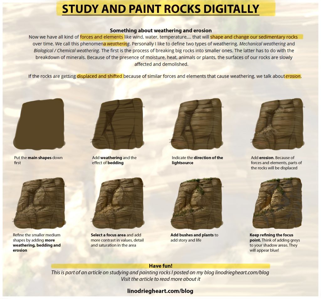
Googling rocks will learn us that we can define multiple types and that they are not the same at all. In our reference we clearly define horizontal lines, an aspect that’s called bedding of rocks. This learns us that in our reference, we have to deal with Sedimentary rocks.

Now we have all kind of forces and elements like wind, water, temperature,… that will shape and change our sedimentary rocks over time. We call this phenomena weathering. Personally I like to define two types of weathering. Mechanical weathering and Biological / Chemical weathering. The first is the process of breaking big rocks into smaller ones. The latter has to do with the breakdown of minerals. Because of the presence of moisture, heat, animals or plants, the surfaces of our rocks are slowly affected and demolished.

If the rocks are getting displaced and shifted because of similar forces and elements that cause weathering, we talk about erosion.  In our reference, we have both occurring at the same time.


Let’s get into painting rocks

Once you researched the hell out of your subject you can safely open your painting software and start studying

Feel free to download the cheat sheet:


I wrote this tutorial based on my own experiences. Should you have other helpful tutorials or resources on this topic, feel free to share them so everyone can benefit from it.
Let me know if you had a chance to try this technique and if it was any good to you!


Related topics:

Visual Library: Why you can’t live without it
Design Principles in Concept Art and Design
Weekly Challenges group on Facebook


The post Study and paint rocks digitally appeared first on Lino Drieghe.

Report

Create impactful compositions with value grouping

General / 15 January 2018


Value grouping

Often times when planning compositions for paintings, students tend to only think about arrangements of shapes and lines but forget about value. Applying principles like the rule of thirds, balance or other design principles can get you really far, but thinking about grouping values will bring your compositions to a whole new level.

You don’t want to forget about the importance of good values arrangements and structures.


Readability is key

The best compositions in art are often times simple. They share easy to read shapes that can be recognized within seconds. In the example above, Gustave Doré grouped his light and dark families together. By doing so, they make up simple shapes that benefits the readability of the picture.

Avoid over detailing with lines, shapes and values so the viewer doesn’t get confused. The more confused, the harder it will be for the viewer to understand the picture and it’s underlying message. The lower part of the painting depicts an aftermath of a battle and it contains quite some details, but by linking the values together, it reads as a whole. The burning city of Paris and sky are linked as well, to improve the readability.

By bringing the values closer together in busy areas, we can reduce that area to one simple shape. If you apply this technique throughout your whole canvas, you will have grouped the light and shadow areas to simple, easy to read shapes. This will benefit the readability and therefore composition of your painting.

On areas that matter, i.e. focus areas, you want to arrange your values so that they are contradicting with each other. By having a black on white or white on black, we pull the viewer back to those contrasting areas of your painting. In Doré’s L’Enigme, this happens around the head of the sphinx.


In conclusion

  • By grouping our values together we can create more harmony in our compositions. That’s why you’ll often hear artists telling you to limit your values
  • The fewer the values, the better the read. I personally like to limit my values to a light, mid and dark
  • Outbalance your values so you achieve contrast in their ratio. E.g. 60% dark value, 30% mid value and 10% light value

Let me know if you already use this technique and if it helps you getting better reads in your compositions. Maybe you use other techniques? I would love to hear about them in the comment section below.


The post Create impactful compositions with value grouping appeared first on Lino Drieghe.

Report

Integrating figures in your paintings

General / 11 January 2018

Once upon a time I received the question if I could create some card art for Fantasy Flight Games’s Arkham Horror LCG: Lost in time and Space. When I needed to integrate figures in my paintings I thought of adding  Adobe Fuse and Adobe Mixamo to my workflow.

Use time savers like Adobe’s Fuse and Mixamo

Among other cards, I created the Vast Expanse card. The card features a detective in a unearthly and psychedelic world.

This is how the original image looked like

With Adobe Fuse, I was able to create my own 3d character in a very quick and intuitive way.

The program itself is very straight forward. It has a clear workspace with your model in it to your left and options to adjust that model in the form of sliders and buttons on your right. You can chose to go through the different stages of creating a 3d model. From assembling the different body parts and customizing them, to finally adding clothing, textures and patterns on top.

Once finished, you can save and upload the figure to Adobe Mixamo with the ‘Save to Mixamo’ option in the right upper corner. Just name your character and Adobe Mixamo will pop-up in your web browser.

For this project I created my own custom character in Adobe’s Fuse

With Adobe Mixamo, you can animate the 3d character in your web browser. The options are somewhat limited though so don’t expect an online posing tool (read a little bit further to find out which program to use for that).
You can chose to work with one of the many standard characters or upload one yourself. Once loaded in the web browser, you can select animations from a quite extensive database.

A render option is not available but you can easily solve this by taking a print screen of your web browser and opening it in Photoshop. After all, we’re not interested getting high quality renders but in finding interesting poses and correct proportions. It will give you a perfect starting point on which you can start painting.

…You can easily get distracted by the fun animations :-)…


Take it a little bit further

If you’re looking for a program that allows for more animation capabilities, DAZ 3D could be a solution. It will allow you to pose a mannequin in very intuitive way by the use of controllers and sliders.

In the image below, I had to depict a girl fleeing from a horde of zombies. Because the girl was the focus point, posing her in DAZ 3D and rendering her in 3Ds Max allowed me to nail to down the proportions and perspective correctly. Once the pose was in place, I used photos to overlay the different body parts with textures and patterns.


Create your own databases

Make a database with figure renders and paintings. That way you can pick from it when working on other project as well. It doesn’t have to be anything fancy, just a .PSD with different layers for each figure will do just fine.
Off course you’re not limited to figures only, I have my own databases for plants, buildings, props,… too.


The post Integrating figures in your paintings appeared first on Lino Drieghe.

Report

Set the right mood in your paintings

General / 04 January 2018

The importance of values

We can define a colour by using following parameters; Hue (blue, green, yellow,…), Value (light to dark) and Saturation/Chroma -to keep things simple- (the intensity of the colour).

When just starting out in digital painting, you may be in doubt if its better to start in values (greyscale) or colour first. Here’s why you want to start with values first:

  • Value changes = form changes. We see the world around us by use of light and shadow. If something gets darker it means it’s turning away from the light.
  • Next to saturation, values are used to create focal points in paintings and illustrations. The human eye is naturally drawn to areas with contrast, i.e. light on dark or dark on light.
  • By using gradations of values you can create a sense of depth. An important part of Atmospheric Perspective.

Value structures

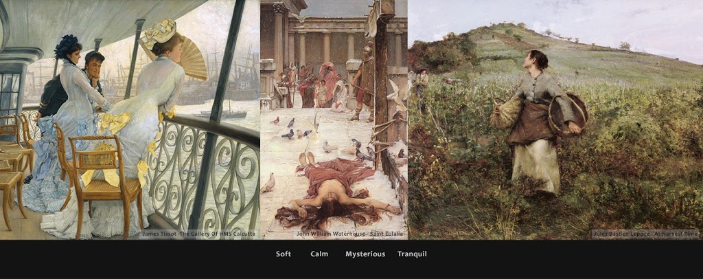
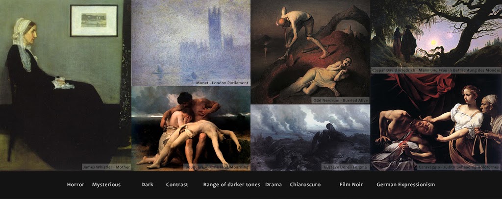
Often times artists will chose to work in a certain range from light to dark (value range) to keep the painting readable, organized and structured. They deliberately chose to simplify and limit their available values depending on the mood they want to convey.

Value keys can be compared to vocal ranges or like setting the exposure on a camera.We can define three different value keys:

  • high key
  • mid key
  • low key

High key

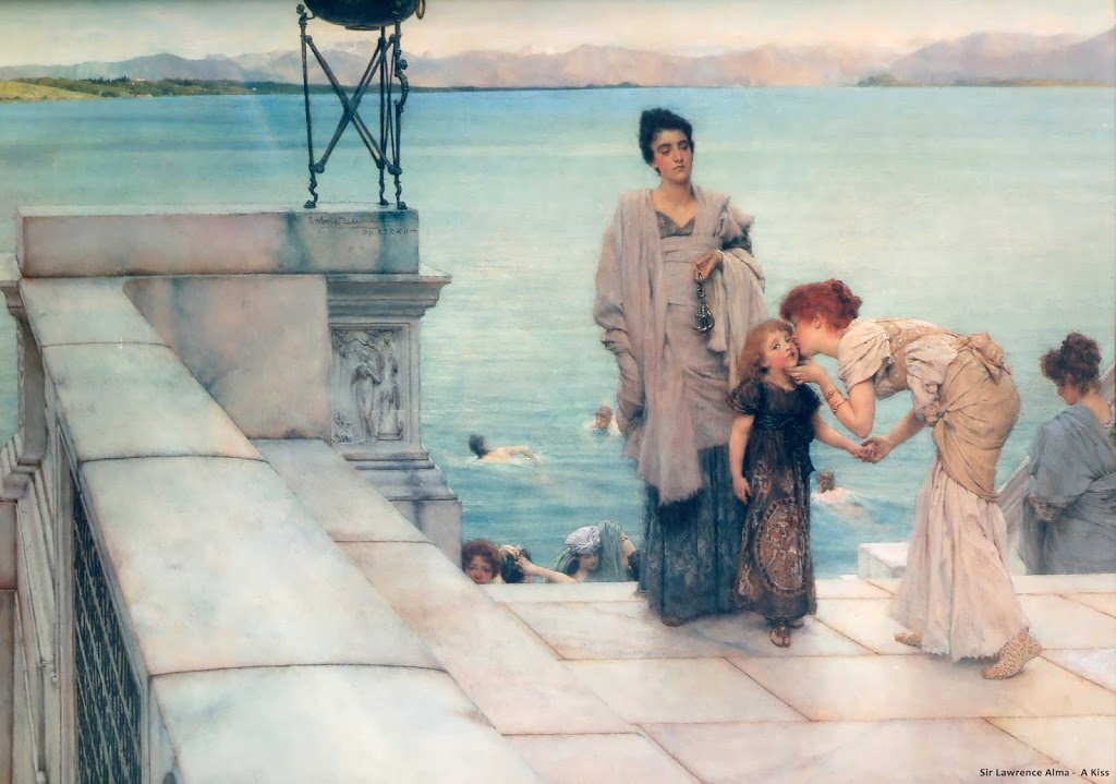
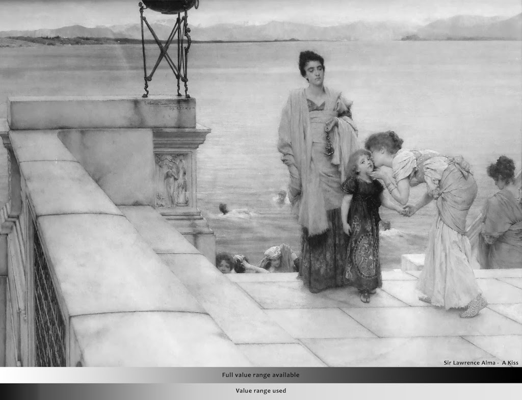
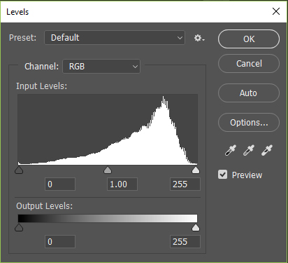
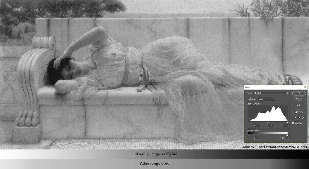
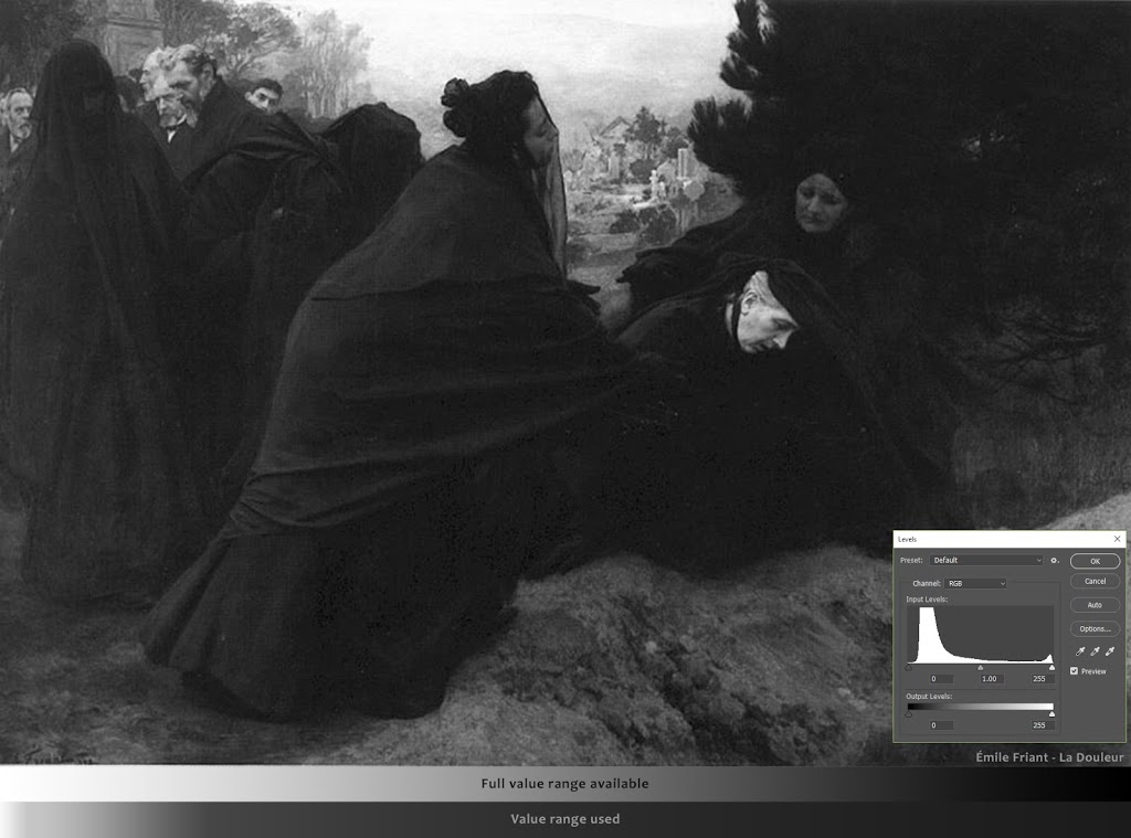
You can check the value range of your painting or, in this case, a painting by sir Lawrence Alma, by using the Levels adjustment tool (Ctrl+L) in Photoshop. This will show you a diagram that may look like the one on the left.
Photoshop indicates the values of the painting on a scale from 0 to 255 where zero is dark and 255 is light. The pixels that corresponds with the right value will be presented by a white line.

The diagram clearly shows that most of the pixels in this work are situated at the right end (light) of the value scale.

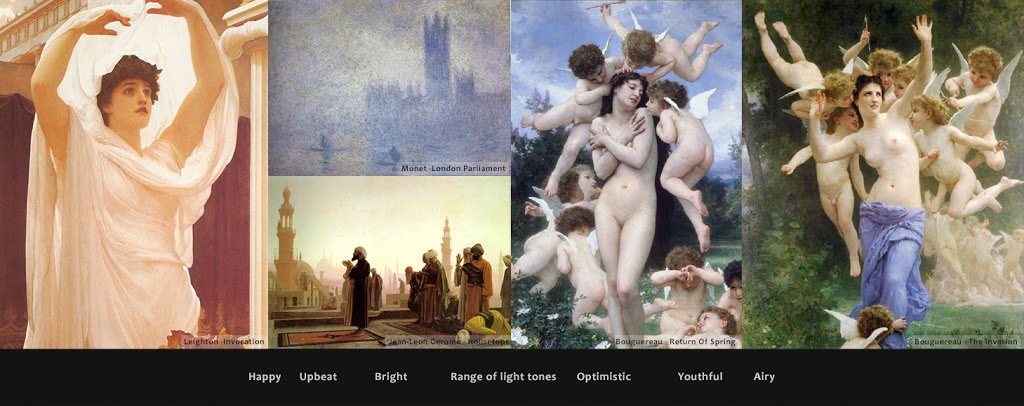
Following moods can be considered if you want to work in a high key value range:

Mid key

When opening the painting in Photoshop and we check the value range, we notice that most of the values are situated in the middle range. Remember, there can always be certain values that are situated on one or both ends of the scale, acting as focus points or guiding the viewer around the painting. Most of the values are situated in the middle though. This is also visible when comparing the value gradients.


Low key


 In conclusion

  • Decide mood first
    Before starting a painting, decide your mood first by choosing a value structure – Ask: ‘What mood do I want to convey?’-. You can remember yourself to stick to the chosen structure by putting your lightest and darkest value down as a reference.
  • Every key works
    Neither key is more correct or incorrect then the other. They all have their own purposes -setting the desired mood-, so the same picture can be painted in either key. Something Monet pulled of with his series of paintings of the Cathedral of Rouen:

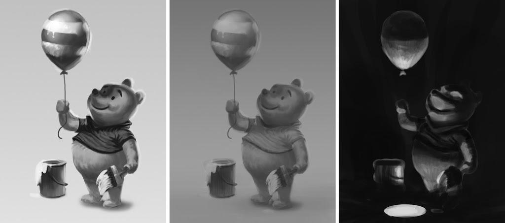
As an exercise, Google a line-art drawing and shade it in the three different keys. I took a line-art of Winnie-the-Pooh:


Have fun!
-This topic can definitely explored more, so if you have resources on this, please share in the comment section below, thanks!


The post Set the right mood in your paintings appeared first on Lino Drieghe.

Report

Visual Library: Why you can’t live without it

General / 25 December 2017

What is Visual Library?

Visual library (short VisLib) are fragments and collections of images and experiences stored in your head. Think of it as a large library in your house containing different kind of books and for every new experience you can add a new book to the shelve. The bookshelves contain all your knowledge.
When drawing from our imagination, we use those books.

The bigger your visual library, the much more believable and understandable your end result will be. Remember, readability is key in good design principles.

How can I add more books to my shelve and build my Visual Library?

  • Study from life and references. But observe mindfully
  • Visit museums
  • Read books and specialized magazines
  • Watch documentaries
  • Build scale models
  • Go outside and use all your senses

Observe mindfully, it can’t be stressed enough. Let’s say that seven of the ten times when we study from references, we don’t observe fully and are mindlessly copying one shape after the other. Sadly enough, it still happens to me as well.
The end result could be a nice copied drawing or painting but we didn’t really learn from it. You should force yourself to really see and understand the object in front of you.

This phrase may sound familiar and is somewhat related: ‘Don’t draw what you think, but what you see’

Shortcuts have to be found and rules applied to remember certain shapes or forms, i.e. we have to break down and analyse the reference first before we can recreate it afterwards from our imagination.

Go outside and use all your senses. You don’t have to be drawing or painting to build your visual library! It can be done all the time and everywhere.
Look and observe. The colours of shadows, light patterns on the ground, values and proportions, feelings,…
Experience the here and now, take at all in and store it in your head.

I like to think of it like this: when a group of people is gathered, you can tell who the artist is by finding the person who is staring at the clouds or patterns on the ground. The person who may be acting a bit funny and weird at first but who is actually getting his hands dirty to understand more about life and everything in it.

It’s wearisome in the beginning but you’ll get better at it over time. Like everything in life, it takes practice and doesn’t come overnight. At certain times, it will even be relaxing. It allows us to take a step back from our hasty lives and just enjoy the small things surrounding us.

In practice

If possible, study from life first, from reference second. When drawing and painting from life, all our senses are used and the experience will last longer.
You can easily test yourself by studying from life or reference first, secondly hide the source and your study and finally draw the image again, this time from imagination.

To help my students in building their visual library, I created this Build your visual reference video and a Weekly Challenges Facebook group. It’s a place where people can post their studies and learn from each other. It’s open for everyone, even if you’re not in Digital Arts and Entertainment. Feel free to join and share you weekly sketches.


Resources

Be sure to check out this video about Visual Library by Feng Zhu made for his Design Cinema series on Youtube!
Another video on Youtube about Visual Library by Sinix Design.


The post Visual Library: Why you can’t live without it appeared first on Lino Drieghe.

Report

Design Principles in Concept Art and Design

General / 18 December 2017

Introduction to the Design Principles

While teaching our Digital Arts and Entertainment students, a big part is focused on the principles of design, i.e. ‘How to make an image more pleasing and appealing? – i.e. ‘How do I make something cool?’

I was thinking of a way to explain those principles in a clear and understandable way to my students and was looking for this perfect example. One day it suddenly struck me. Every day I pass by this facility when getting to work. It shows the principles of design in all its beauty:

Probably it seems I don’t make sense at all but things will get clear soon…

I came to the realization that there are two main key words you want to remember when talking about design and making interesting imagery: Contrast and Variety. 

When I talk about contrast it applies on certain differences between shapes, textures, details, heights, orientations,…
By having Contrast you end up with Variety. Having Variety and Contrast makes for Interesting designs.

Interesting designs = cool 

Over the years I was able to build a list of principles based on my own experiences and others (see the resources at the bottom of this post), that will help you get contrast and variety in your designs and hopefully one step closer to a successful end result.

  Proportions and 70/30 – 80/20 rule
Readability and Functionality
Overlap and Multi-layering
Design line and Stance
Silhouette
Shading and form
Symmetry and Asymmetry
Rhythm and Repetition
 Let me go over some of the principles and explain to you why this is a sexy image

Some of the Design Principles explained in depth

Proportions and 70/30 – 80/20 rule

This principle is all about Big, Medium and Small. Applying this rule will automatically result in contrast and variety of shapes. The principle can be applied on shapes, lines, details… and even on value patterns. To give you a brief example, you want to avoid having 33% white, 33% grey and 33% black in your image. A better arrangement could be 10% white, 30% grey and 60% black. (I hope to go deeper into this in another post).
There will be no similar sized shapes, therefore they are not competing for attention which will result in a clear focus point.

A connected principle to Proportions is the 70/30 rule. You could call it the 71/29 rule if you want to, hence why I wrote 80/20 rule as well. It comes down to this: to have contrast and variety you want to avoid a 50/50 arrangement where everything is the same size or length. The picture bellow will clarify what I mean:

The doors on the left trigger the interest of the viewer because there is a variation in sizes. In the example on the left, I lowered the the height of one door, resulting in a less interesting design. One could argue that the door on the left is still interesting because of the overlap the railing is creating and they would be totally right about that ;-).

Readability and Functionality

Readability and functionality are important principles to keep in mind, especially when designing functional objects like vehicles and machines. Good readability can come from a strong silhouette or from good distribution of detail like shown in the picture below. You don’t want to detail everything  but leave empty spaces between areas that matter. That way your viewer has areas for his eyes to rest. It is in these detailed areas that you add functionality to your designs. I.e. you add details to explain how something works.

Functionality adds existing elements to your design to make the concept understandable and believable enough for the viewer to understand. More then often I encounter designs that lack simple details around areas where to objects meet or are connected with each other, resulting in a ‘glued together’-feeling. All it takes is some detailing around those areas to make the design more readable and functional.

Just by adding some minor details on places where at matters (eg. pivot points), we make this design more readable

A side note to this principle: Maybe you’re familiar with the phrase ‘Form follows function’ or ‘Function over form’. As an example; a fast going vehicle will be more designed because it has to be aerodynamic in order to go fast. The focus will be on the design. Whereas a heavy construction vehicle will be less designed and has a bigger focus on functionality.
It’s important to find a nice balance between design and function so you strive for a pleasing aesthetic feeling.

Silhouette

To put this simple; a silhouette is the black and white version of your design so we can focus on the contour of the design. By filling up the shapes of your design you can check if the design and functionality are still readable and understandable. You can ask yourself if  ‘it has interesting ins and outs, do I have negative spaces and is the design still readable from afar?’ 

In drawing you want to avoid flat and long endless lines and shapes without anything happening to it. I often times compare it with a heart beat on a monitor. Flat lines are lifeless, the heartbeat itself expresses life and interest.

Rhythm and Repetition

Rhythm and repetition will create a certain flow in your design that you can use to lead the viewer in a certain direction and ties everything together as a whole. You can easily compare it with music notes. When a musician would randomly play some notes it would sound clueless and indecisive, whereas the musician ties everything together smoothly it becomes this beautiful composed masterpiece.

E.g. Repetition can be a repeated circular shape in your design that gently leads the viewer through your design. Within the repetition of elements you want to make sure to put variation as well by changing the sizes or orientations.


Design Principles in practice

As you may have noticed it is not necessary for you to try and include all these design principles in your designs. You have to decide for yourself which principle will help you to enforce a certain mood and feeling. The principles that always stand by me when fighting design problems are : Proportions, Overlap, Design line, Silhouette and Shading (i.e. PODSS). Learn this abbreviation by heart and it will become your design-saver for life, trust me! ;-). 
 
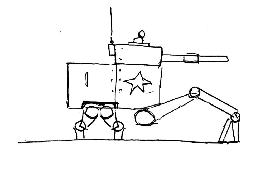
So how does all of this apply to art and design in particular? Let me explain with the following design and let us see how PODSS can be of any help to us:

First we want to write down what we like and dislike about the design so we know what to work on:

What I dislike about the design and want to change:

  • Proportions are too alike
  • Maybe the design line / stance could be improved on to get more character in the design
  • The functionality is lacking, i.e. We don’t understand how the legs would function
  • The silhouette is not on its best. Interesting ins and outs can be used to show the functionality of the design better and rotation/pivot points
  • The object looks flat and misses volume, applying some shading and having overlapping elements could fix this.

What I like about the design and want to keep:

  • The figure, it definitely sets a scale for us so we understand the design better
  • The ground line, the vehicle looks grounded and in place
  • The details, they tell us a bit more about the history and story of the design
  • The long leg in the front gives it a certain ‘dragging or crawling’ vibe. Maybe we want to keep that feeling
  • The repetition of the circular elements are creating a certain flow through the design

We should address the proportions first. By applying the Proportion and 70/30 rule we can make this design more pleasing:

The proportions are more interesting but the stance could be pushed. We’ll try to incorporate some overlap as well:

The legs are still missing functionality, by looking at references and doing some minor detailing we can easily fix that problem. You want to focus on creating an interesting silhouette at the same time:

We pull everything together with some hatching to indicate the forms. Story details like smoke, dust, holes and dents can be added to give your design more life:

In conclusion

Hopefully you’re able to incorporate some of the design principles in your own work from now on. To make things easier, I created a ‘Design Poster’ for you to download. It fits on an A4 so it’s ready to print out and to be put on your refrigerator :-).

Please share if you have more resources available on this topic in the comment section. I would love to hear about them. Personally I found following website and book quite helpful:

Resources:
THUMB WAR: Design Iteration Combat Simulation by Paul Richards: https://www.autodestruct.com/thumbwar.htm : Please check this and the rest of his blog out!

Downloads:


Have fun designing!


The post Design Principles in Concept Art and Design appeared first on Lino Drieghe.

Report